The Ultimate Guide to a Winning Email Design
In a world where billions of people have email addresses, it’s an email marketer’s dream to have the ability to promote products and services to so many prospects. However, this comes with an unavoidable drawback: the average person receives dozens of emails a day, all clamoring for attention that is in limited supply. Most people will skim over an email to get a basic understanding of its general contents. With such little attention to spare, your email needs to be gripping enough in both its layout and content to hold their attention and encourage them to act. It is why you must carefully consider the design of your email, crafting each section to achieve the best possible engagement from a skimming eye. Here’s a guide highlighting fourteen elements of good email design that you can apply to increase the success rates of your marketing strategy.
Visual design elements
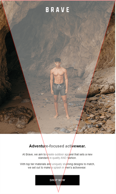
1- Triangular/zigzag content arrangement
For a reader that glides over content quickly, your email needs to guide the movement of their eyes. An upside-down triangular arrangement is popular, as it directs eye movement straight down to the call of action, much like a down-facing arrow. A zigzag formation with text and imagery alternated on either side is also popular but heavily relies on plenty of alluring imagery. Whichever arrangement you choose, let the eyes always finally rest at the call to action button in the end.

2 -Mobile optimization
3- Brand indicators
Whatever template you create for your emails, always have your brand appear visibly within it. Remember that the email recipient is more likely to skim over the content, so immediately recognizing your brand logo and colors is the fastest way to identify your business as the sender.

4- Visual content
Few things breed disinterest in skimming readers faster than long-winded paragraphs of prose. On the opposite end of the spectrum, well-taken and edited images and videos excel at attracting and holding attention. Keep them on brand, and remember that emojis can also present your content in a livelier light. Don’t be afraid to use them thoughtfully in your subject line too!
Email content elements
5- Personalization
- Reference user-specific data that you've collected from their activity on your website. Data could include geographic locations, preferred user settings, product preferences, and so on
- Where possible, refer to a user by their name.
- Integrate behavior-triggered emails for each action that users take on your websites like signing up, making a purchase, or even unsubscribing.
- Create a customer persona for your target audiences and tailor your emails to fit their specific projected wants and needs.
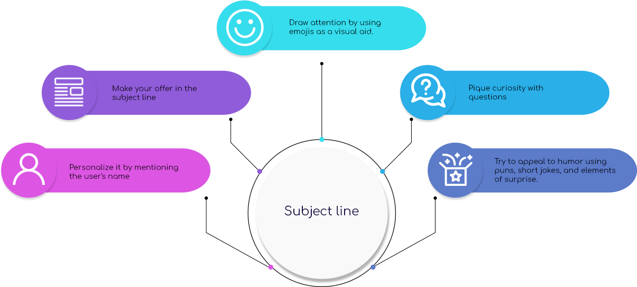
6- Attractive subject line

7- Thought-out pre-header text
After the subject line, users will also see the pre-header text before they open the email. The pre-header text is preview content that complements the subject line and can only carry a few words with so little character space. Make yours count by crafting it to give more context to the subject line, helping readers understand what to expect in your email.

8- Short-form content
We live in an age where people consume far too much information. To adapt to this, most of us only quickly glaze over content to glean the necessary details. It does not help to have too much content to read in your emails. Long blocks of text will lose readers’ attention quickly. Keep your body text short, breaking up the paragraphs as well.
9- Clear call to action
After making your offer, you should always conclude with a call to action that encourages recipients to click through the links in your email. The call could be to make a purchase, sign up for a trial, or access a specific download.
Make it short, concise, and easy to spot within the email. Link it in text, in bold colors, or on top of a brightly colored button that readers can find quickly
10- Value-added content
Make reading through your email worth a recipient’s while! It can be tempting to just plug a quick promotion here and be done with it. However, added value is the element that persuades them to click through your call to action since they see something in it for them. Here are a few tips to help add value to your emails.
11- Links and buttons
The goal of your email is to convince its readers to take a specific action. Make taking this action easy by embedding links in your text and images. Buttons are great alternatives to links because you can design them to be even more attractive with bold colors, animations, and more. Make your links or buttons relevant, redirecting users to the right page on your website.
Trust-building elements
12- A trustworthy sender name
Build trust with your prospects by letting them know who is sending the message to them. Your company name must always appear in the sender name as an identifier of your business. Other variants such as company and staff or team member names help to humanize you as the sender to the recipients who will now feel like they’re receiving communication from a fellow human instead of a bot

13- Visible contact information
A reputable company should always list its contact information at the bottom panel of its email because sometimes a prospect wishes to contact them directly. This information can include a telephone number, a company physical location, and more! Having this information visible also lends to your credibility as a business.

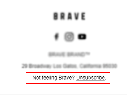
14- Easy to access the 'Unsubscribe' button

